Marks & Spencer Spring phase 2 launch
I have been working as a visual stylist at M&S for 4 months now and I thought it was about time I start taking some photos of the mannequins I dress and the configurations I put together. We are currently implementing Spring phase 2 so all the displays in the store are changing. These are just a few of the ones I have done (some have been completed with the help from other members of the visual team).


This is the Coats display and as you can see there is a nautical theme to it with the use of the red, navy and cream. A few of the items have been seen in Vogue so we wanted to showcase them in store as we predict them to be some of our bestsellers this season.

This is the M&S collection Knitwear display. It is quite simple with the use of pastel blues which is another key trend this season. The mannequin on the plinth has the cobalt blue coat to really stand out and draw in the customers attention.


This is what we call Casual Collection 1. It is for your typical M&S customer so it is important that it looks appealing to them and that the clothes used and the outfits put together are ones they would actually wear but not necessarily have put together themselves. We want to inspire them to be creative with their fashion. The collection title is "Botanical" so the colours are quite neutral and earthy so you can mix and match them together quite easily to help outfit build quite easily. There is also the use of print to add to the "Botanical" theme so there is the use of flower and leaf prints to add a bit of interest to the collection and to the main display. The use of accessories help add interest to the mannequins if the outfit needed a bit more excitement. The scarves have a floral aspect to add to the theme and the tan accessories compliment the clothes well. I then dressed the table in a way so it is easy for the customer to shop what is on the mannequins so certain pieces used are folded and displayed on the table.


The next display is Casual Collection 2. Aimed at the same customer just using a different clothing pack with a different colour scheme and theme. The title for this collection is "High Tide" so it needed to feel more nautical and have a travel vibe to it. The main colour scheme for this collection was blues, pinks and neutrals. This created quite a sophisticated display with the pops of hot pink adding excitement and drawing in attention from the customers. There is a lot of outposting sunglasses on the display to convey the travel theme and the accessories used are tan once again to compliment the colours of the clothing. The table is dressed in the same way as before to make it easier for customers to shop the looks with ease.

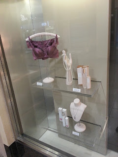

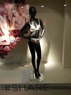
This is the Valentines window that we currently have at the store at the moment. I implemented this with another member of the visual team. The focus of the window is the Rosie lingerie so it is a simple scheme to showcase it at is best.

This is the Cashmere display which follows the same type of scheme as the Knitwear display but is pushed to the next level due to the price point. The colour scheme is blue and grey which works together very well and makes an eye catching display due to the brightness of the blue. All the mannequins are linked with the colour blue so all link together well and make a clear colour story. Cashmere is a higher price point than the normal knitwear instore so the use of the grey adds a sophistication to the plinth.

The Classic collection instore is aimed at the older M&S customer so this needs to be kept in mind when creating the display. The use of pastel colours keeps the display on trend still but mixed with the fabrics and style of clothing it manages to keep the display age appropriate.


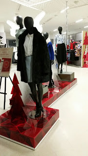
The Smart Collection area of the store is for the M&S customer who wants to shop going out/party/work related outfits all in one part of the store. The colour scheme at the moment is quite bright with the use of lime greens, white, neutrals and black. These colours have also been seen in Debenhams and BHS. The outfits work quite well with the simple colours paired with the lime green to add excitement to it and grabs peoples attention.


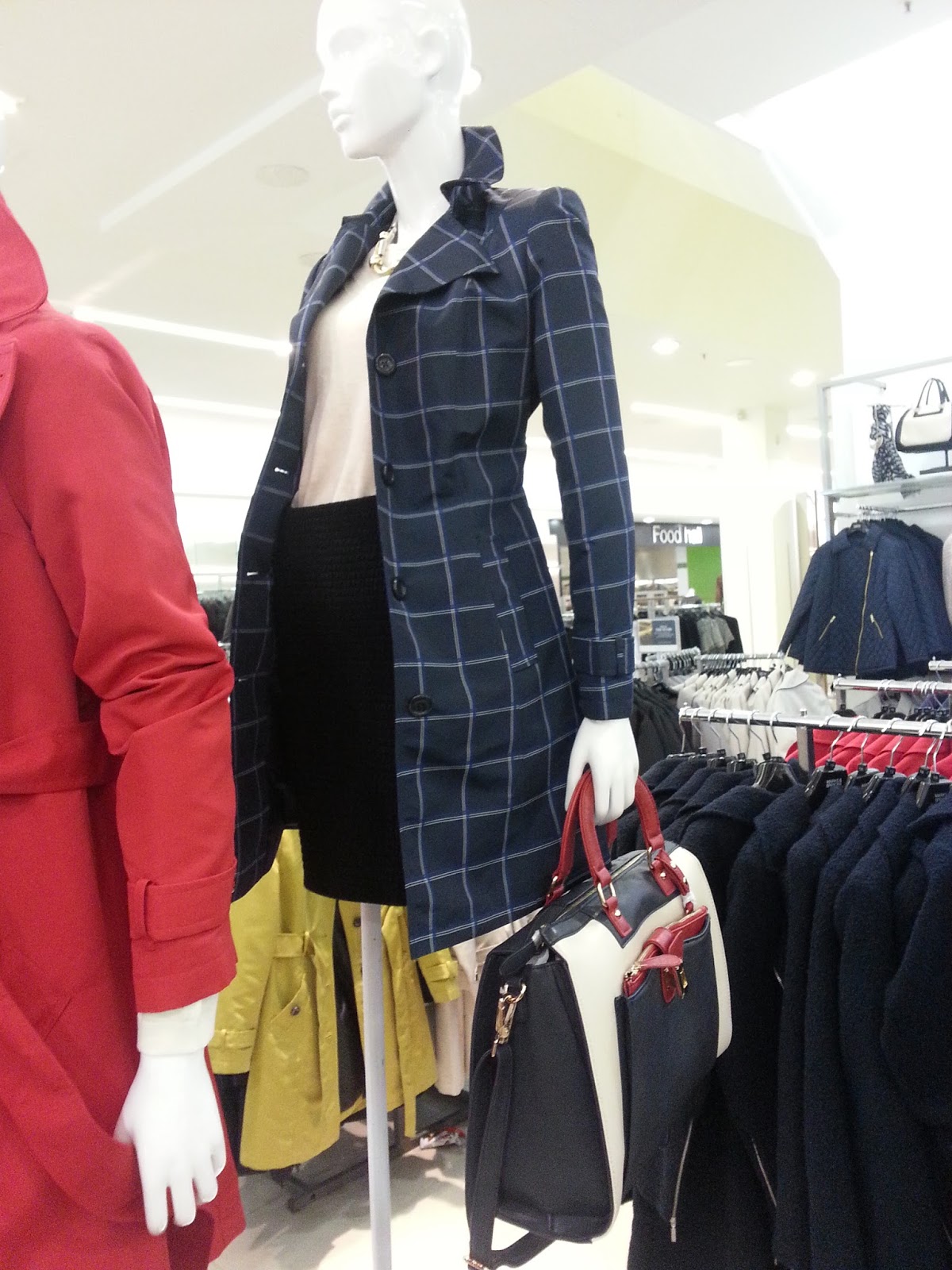
This is the Coats display and as you can see there is a nautical theme to it with the use of the red, navy and cream. A few of the items have been seen in Vogue so we wanted to showcase them in store as we predict them to be some of our bestsellers this season.

This is the M&S collection Knitwear display. It is quite simple with the use of pastel blues which is another key trend this season. The mannequin on the plinth has the cobalt blue coat to really stand out and draw in the customers attention.


This is what we call Casual Collection 1. It is for your typical M&S customer so it is important that it looks appealing to them and that the clothes used and the outfits put together are ones they would actually wear but not necessarily have put together themselves. We want to inspire them to be creative with their fashion. The collection title is "Botanical" so the colours are quite neutral and earthy so you can mix and match them together quite easily to help outfit build quite easily. There is also the use of print to add to the "Botanical" theme so there is the use of flower and leaf prints to add a bit of interest to the collection and to the main display. The use of accessories help add interest to the mannequins if the outfit needed a bit more excitement. The scarves have a floral aspect to add to the theme and the tan accessories compliment the clothes well. I then dressed the table in a way so it is easy for the customer to shop what is on the mannequins so certain pieces used are folded and displayed on the table.


The next display is Casual Collection 2. Aimed at the same customer just using a different clothing pack with a different colour scheme and theme. The title for this collection is "High Tide" so it needed to feel more nautical and have a travel vibe to it. The main colour scheme for this collection was blues, pinks and neutrals. This created quite a sophisticated display with the pops of hot pink adding excitement and drawing in attention from the customers. There is a lot of outposting sunglasses on the display to convey the travel theme and the accessories used are tan once again to compliment the colours of the clothing. The table is dressed in the same way as before to make it easier for customers to shop the looks with ease.


This is the Valentines window that we currently have at the store at the moment. I implemented this with another member of the visual team. The focus of the window is the Rosie lingerie so it is a simple scheme to showcase it at is best.

This is the Cashmere display which follows the same type of scheme as the Knitwear display but is pushed to the next level due to the price point. The colour scheme is blue and grey which works together very well and makes an eye catching display due to the brightness of the blue. All the mannequins are linked with the colour blue so all link together well and make a clear colour story. Cashmere is a higher price point than the normal knitwear instore so the use of the grey adds a sophistication to the plinth.

The Classic collection instore is aimed at the older M&S customer so this needs to be kept in mind when creating the display. The use of pastel colours keeps the display on trend still but mixed with the fabrics and style of clothing it manages to keep the display age appropriate.


The Smart Collection area of the store is for the M&S customer who wants to shop going out/party/work related outfits all in one part of the store. The colour scheme at the moment is quite bright with the use of lime greens, white, neutrals and black. These colours have also been seen in Debenhams and BHS. The outfits work quite well with the simple colours paired with the lime green to add excitement to it and grabs peoples attention.

Comments
Post a Comment